“You’ll know it when you have it” is the most repeated and least useful advice in early-stage building. You will not know. You will hope. Here are the numbers that settle it, with actual thresholds.
Product–market fit is measurable through five signals: whether your retention curve flattens, what share of active users would be “very disappointed” to lose the product, how many customers arrive without your personal involvement, how long it takes a new user to reach value unaided, and what happens when the product breaks. Three or more in the strong band, sustained over a quarter, is as close to a verdict as this gets.
The reason founders rely on feel is that fit arrives unevenly — strong in one segment, absent in the next — and a good week of sales feels identical to genuine traction. Measurement is what separates them.
The retention curve is the primary signal
Everything else on this page is corroboration. If you measure only one thing, measure whether people keep coming back.
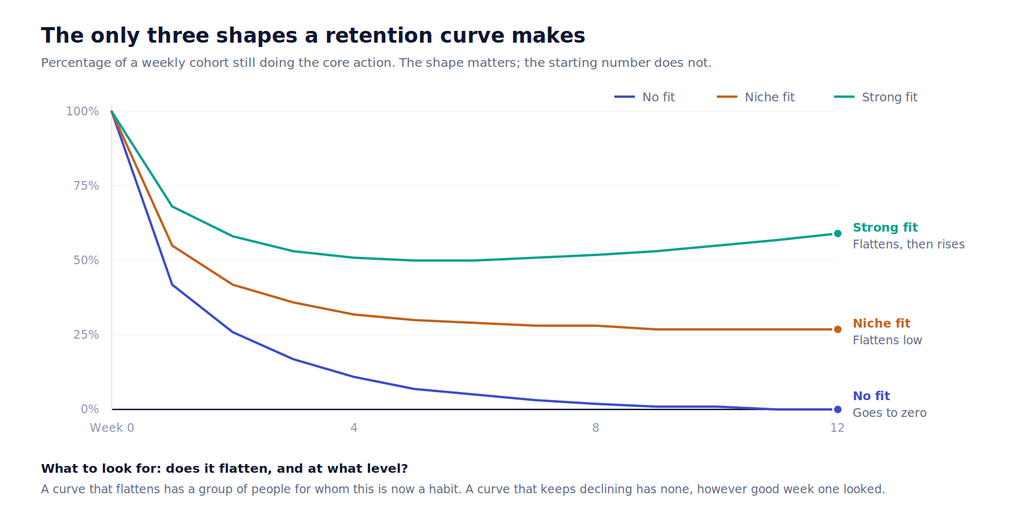
Read the shape, not the height. A curve that declines steadily toward zero means nobody has formed a habit — you have a product people try, not one they use. A curve that flattens means a group exists for whom this has become part of how they work, and that group is the beginning of a business however small it looks.
Three practical notes on building the chart:
- Pick the core action carefully. Not logins. The thing that delivers the value — sending the message, running the report, completing the booking. Measuring logins is how teams convince themselves of fit they do not have.
- Use the right interval. Weekly for a product used most days, monthly for something used a few times a quarter. Match the natural rhythm of the job, or the curve tells you nothing.
- Segment the curves. The aggregate almost always hides a segment with excellent retention and several with none. Finding that segment is usually the entire strategic question.
A flat curve at 25% in one narrow segment beats a declining curve at 60% across everyone. One is a business; the other is a demo with good week-one numbers.
The 40% test
The best-known instrument here is Sean Ellis’s survey question: how would you feel if you could no longer use this product? Ellis derived the benchmark by surveying nearly a hundred startups and found that companies struggling to grow consistently had fewer than 40% of users answering “very disappointed”, while companies that were growing exceeded it.[1]
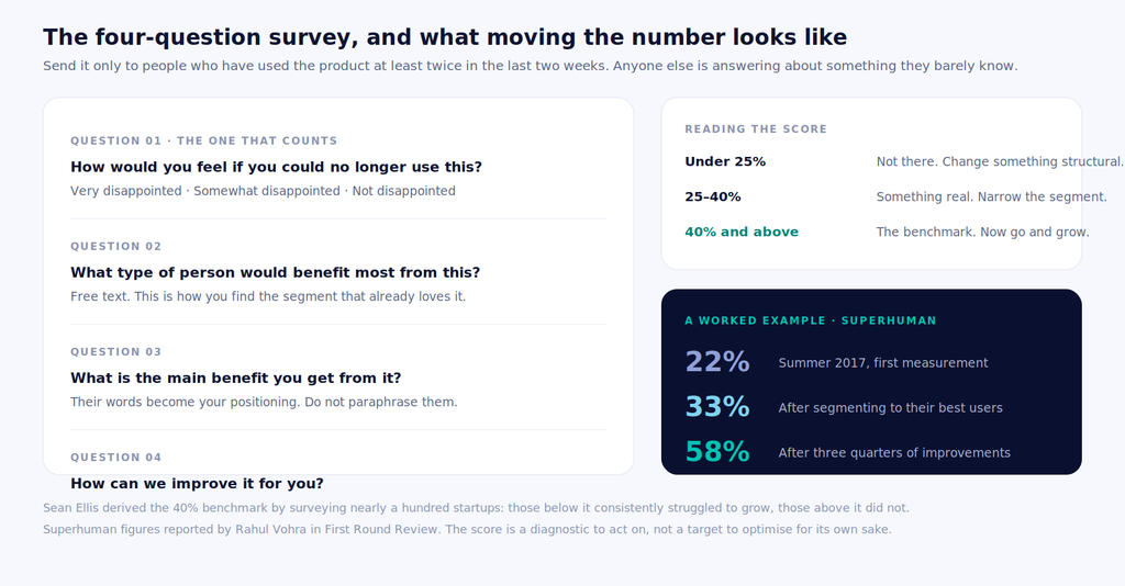
The Superhuman example is instructive precisely because the first number was bad. Rahul Vohra’s team measured 22% in summer 2017 — well below the benchmark. Rather than treating that as a verdict, they used question two to identify which segment already loved the product, focused on those users, and reached 33%. Three quarters of targeted improvement later they were at 58%.[1]
Two things make that method work, and both are commonly skipped:
Survey only engaged users. Superhuman surveyed people who had used the product at least twice in the previous fortnight. Include everyone who ever signed up and you are measuring the opinion of people who barely used it, which tells you about onboarding rather than fit.
Question two is where the strategy is. “What type of person would benefit most from this?” is answered by your happiest users, in their own words, describing the segment you should be building for. That answer is worth more than the headline percentage.
The five signals together
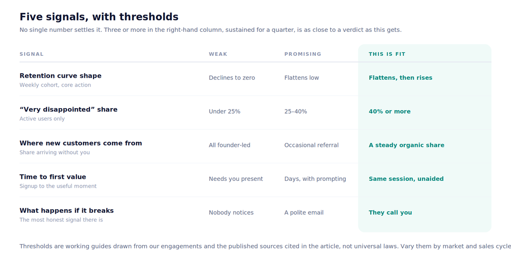
The last row deserves a note, because it is the least quantitative and the most reliable. When your product breaks, what happens? If nobody notices, you have your answer. If a handful of people email politely, you are somewhere in the middle. If people call you — if an outage produces genuine frustration from people whose work has stopped — something real has been built.
Founders often have this signal already and have not counted it. Look back at your last incident.
Usage is not the same as need
A product can be used regularly and still have no fit, and the distinction matters because usage metrics are what dashboards make easy to see.
| Pattern | What it looks like | What it actually is |
|---|---|---|
| Mandated use | High daily usage, low satisfaction | Someone’s boss requires it. Fit belongs to the buyer, not the user — and the buyer can switch. |
| Switching cost | Steady usage, no advocacy | They are staying because leaving is hard. Fragile, and it ends the moment a competitor removes the friction. |
| Novelty | Strong first month, then decline | People explored. The curve will tell you within six weeks. |
| Genuine need | Flat curve, unprompted referrals | The work is worse without it. This is the one you want. |
The clean test for separating them is the fourth question in the survey plus the referral signal. People who need something tell other people about it without being asked. People who merely use something do not.
What to do at each level
The score is a diagnostic, not a grade. Each band has a different correct response.
- Below 25%, curve declining. Something structural is wrong — usually the segment or the problem, occasionally the product. Go back to problem validation with a narrower group. Adding features here is the most common and most expensive mistake.
- 25–40%, curve flattening low. Something real exists inside a broader miss. Find the sub-segment with the best retention, work out what is different about them, and rebuild for those people specifically. This is exactly the move that took Superhuman from 22% to 33%.
- Above 40%, curve flat or rising. Stop improving and start distributing. The most common failure at this stage is continuing to build when the constraint has quietly become reach rather than product.
Fit is per segment, not per company
You do not have product–market fit or lack it globally. You have it with independent clinics in three cities and not with hospital groups; with self-serve users and not with enterprise buyers. Measuring in aggregate averages the two together and produces a number that describes nobody. Segment first, then measure.
How often to measure
Retention curves should be a standing chart you look at weekly — it costs nothing once instrumented and it catches drift early. The survey is heavier and belongs on a quarterly cadence, plus after any significant change in segment, pricing or positioning.
Resist the temptation to run the survey monthly. The sample gets stale, respondents get fatigued, and the number moves within noise, which invites decisions based on movement that is not real.
Six ways teams fool themselves
- Measuring signups instead of retention. Signups measure your launch. Retention measures your product.
- Surveying everyone. Including inactive users produces a low number that reflects onboarding, not fit.
- Reading the aggregate. One excellent segment plus three bad ones averages to a mediocre number that describes no real customer.
- Counting revenue as proof. Founder-led selling can produce revenue with no fit at all. The question is whether customers arrive without you.
- Treating fit as permanent. Markets move, competitors arrive, and a segment that fit two years ago may not now. It is a measurement, not an achievement.
- Optimising the score. The number is a proxy. Chasing it directly — surveying only delighted users, timing the survey after a good week — produces a better number and no better business.